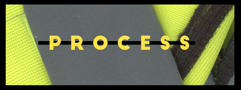
In this segment, I will discuss my design process so that you can see how I was able to get to my final designs.
I believe that the best way for me to show the process that I went through to create my final outcome would be to screen record the entire process, and create a highlight reel of techniques that I’ve used because when I’m in the creative process I am interrupted by the thought of having to screenshot everything that I create and how I create it. For me, personally, a highlight reel would be more effective in showing the techniques that I’ve used to create my final outcome.
In order for my designs to be cohesive and conform to the same themes, I used the same techniques in Photoshop. I used Gradient Maps and Layer Masks as my main techniques.
I used these two tutorials to aid me in creating a burnt paper texture as well as a ripped paper texture.
I tested using this tutorial which was, in the end, not useful for this project but I did try to use this to create the creased paper effect but it came to nothing as it didn’t look as realistic as expected.
Typography
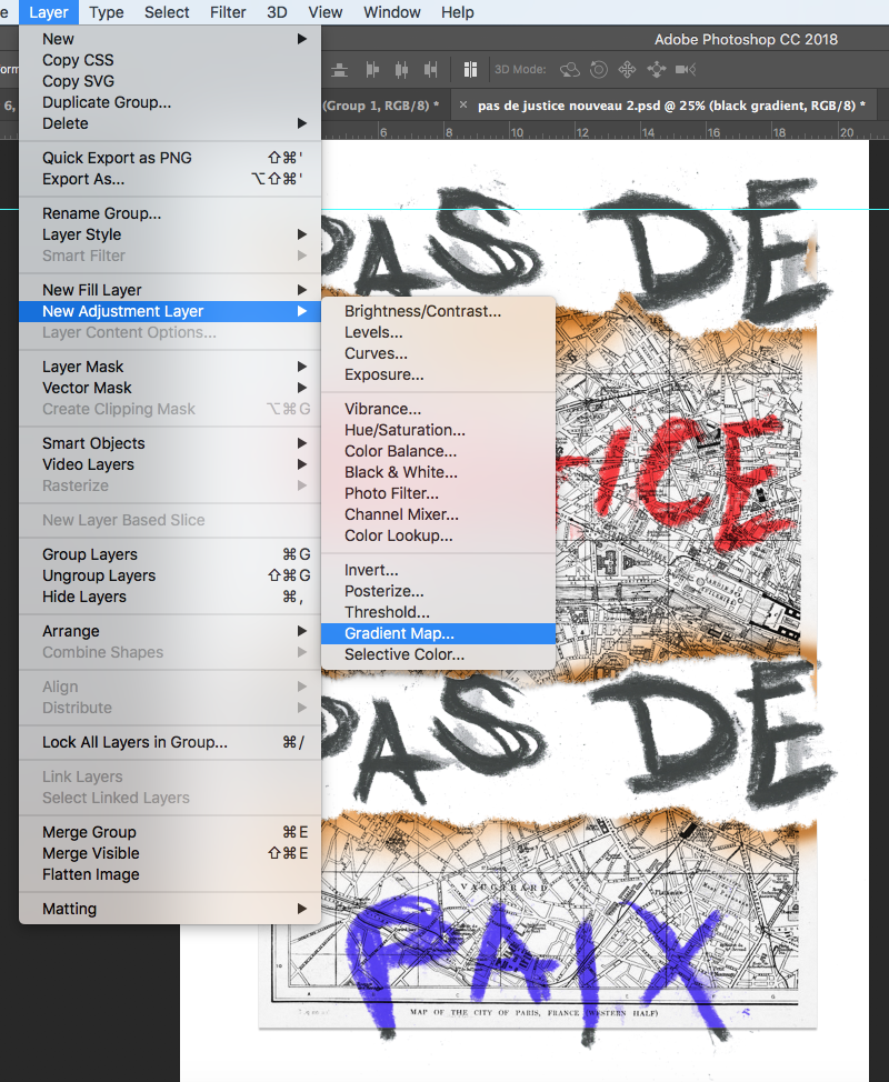
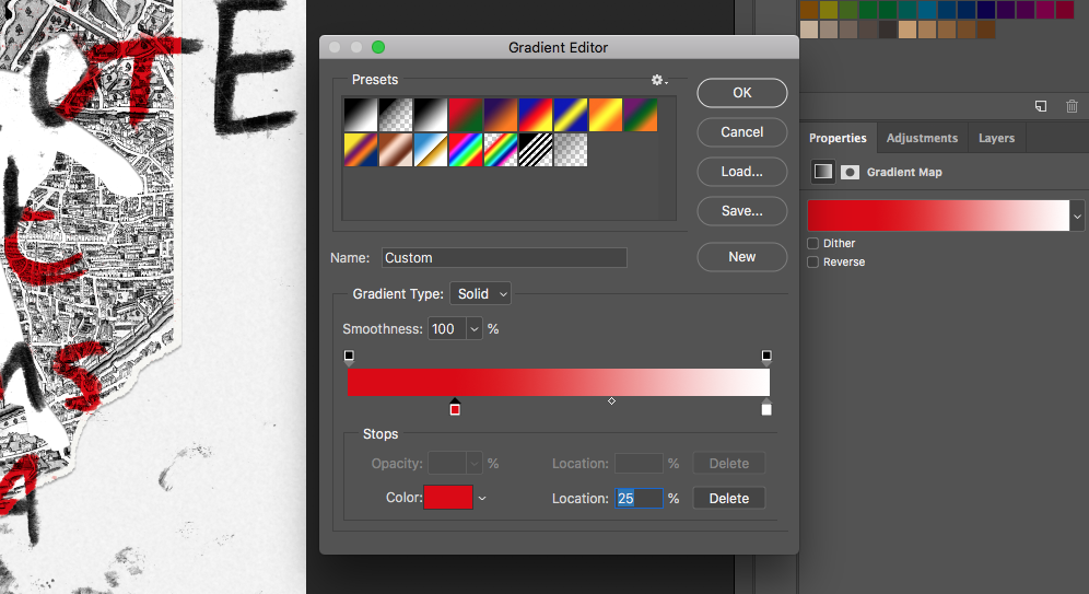

I used my own typography, created using charcoal on paper and scanned it through to Photoshop and used the magic wand tool to remove the background, I then used a gradient map to adjust the colour as well as using a “multiply” mode on the typography to keep the raw texture of the charcoal. However, I originally used a colour overlay paired with levels to adjust the colour but lost the texture and thus lost the whole meaning behind using charcoal typography.
I encountered a problem with my use of colour on my typography, I initially used a colour overlay that made the typography look unnatural and took away the raw emotions displayed by the charcoal – as well as the textures created by the charcoal too. In order to solve this problem, I used “multiply” to keep the textures and make it look written onto the design, and a gradient adjustment layer to change the colour which kept it looking authentic and genuine.
Imagery
For the imagery, I used vintage Paris maps as well as an icon (an iconic photograph from the riots that I then traced and scanned through) and for my “Le monde ou rien” piece I scanned through a Hi-Vis jacket.


I used the two tutorials posted above to create a burned map and a ripped map, I have a few different designs for each map (posted below). I preferred the left design as it hides the “pas de” typography but if you put 2+2 together you realise that the three burn points reveal the same word – which provides reasoning for the burnt paper, to both hide and reveal the typography in the background, as well as contextual importance being that the 2005 riots were identified by the amount of arson caused in the riots.

However, for my “Le monde ou rien” piece I used a different technique for the map; to purposefully set it apart from the rest of the pieces, making it stand out as it is the most prevalent and recent of the riots. I used the “lighten” mode on the map to make it look like the map was designed onto the Hi-Vis jacket and then magic-wand tooled the grey part of the jacket and deleted the rest of the map not on the grey part.
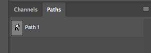

After scanning through my traced icon, I used the magic wand tool to remove the background and used a colour overlay to change its colour to white. I then dragged it onto the map, added noise and a blur to create a paper texture (learned from the ripped paper tutorial) to make it look as if the icon had been cut out of the map – leaving room for a positive and negative effect for the typography to fit through. I used a layer mask to utilise this positive and negative effect with my typography, I also used a path to save the selection of the icon to make it easier for me to trace or feather the edges. I used this same technique to create a similar effect in the “Pas de justice, pas de paix” piece, the only problem was with the smaller gaps created by the tear effect making it look unnatural which I had to fix, explained below.

When adding my finishing touches, I decided to use the blur tool on the typography between the map and where it cuts off to hide any imperfections in my typography, as there is a tear effect in the paper i had to use the blur tool to fill the small gaps created by this tear effect.
As well as using the blur tool to neaten up my typography, I also used the magic wand tool and pen tool to clean up the scanned in typography.
Demo Gallery
This gallery is filled with demonstrations of each technique that I used in Photoshop for my Final Major Project, which I have previously explained.


